

This post originally appeared in the June 17, 2016 edition of The Standard.
The e-commerce, consumer behavior, and user-experience landscapes have changed dramatically in recent years, but nowhere is the change more dramatic than in the use of mobile devices by shoppers, including insurance buyers. At MassDrive Insurance Group, analysis of our own data reveals a tectonic shift over the past half-decade.
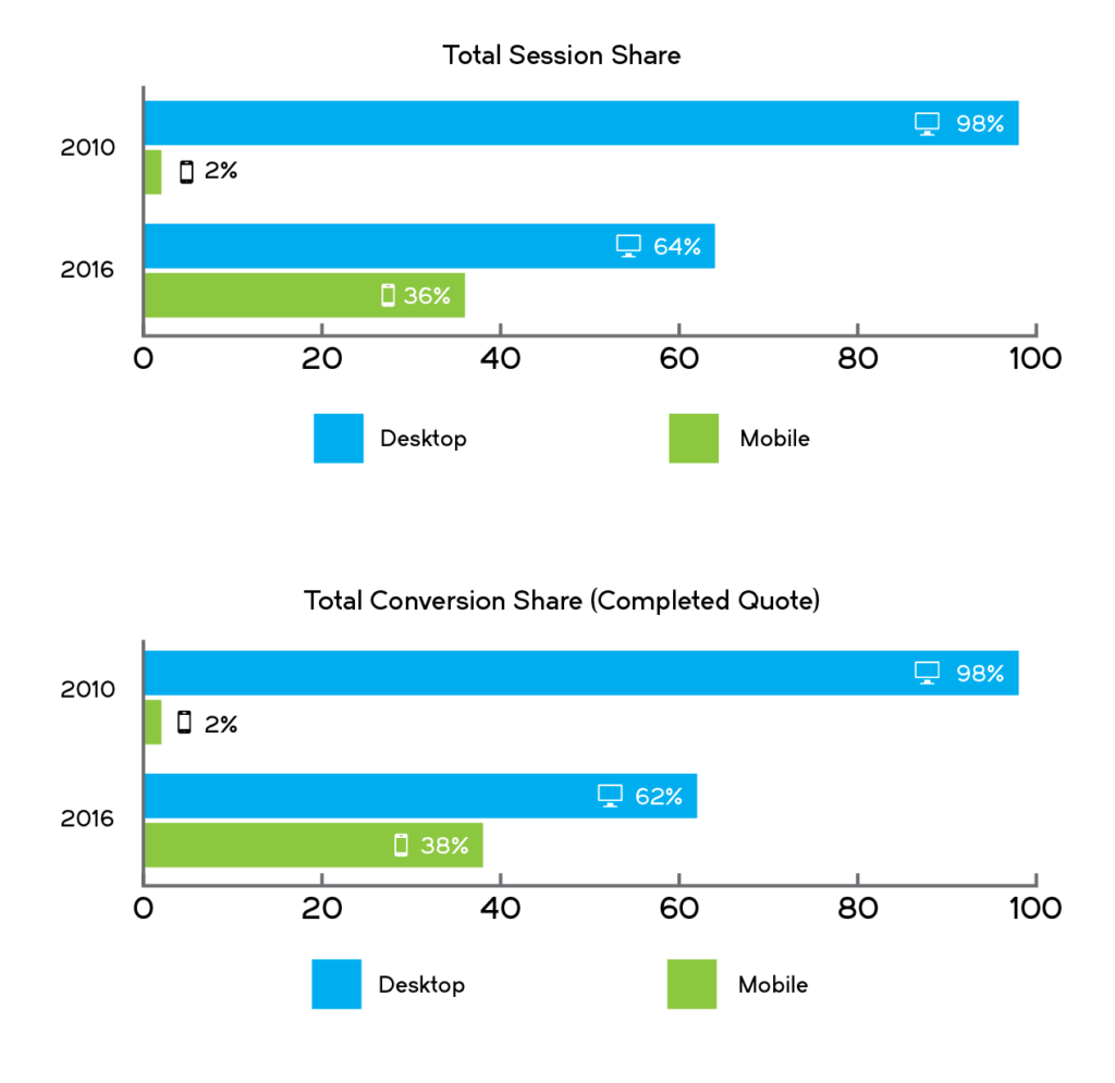
We dug into the Web analytics for our Massachusetts-focused insurance brand, MassDrive.com, for the first quarter of 2010 and compared that dataset to the same period in 2016. The results are staggering: Nearly none of our prospects used mobile devices to get insurance quotes in 2010 and today, it’s getting close to half.
These and similar data points have had a tremendous impact on our strategies. In fact, we’ve completely reworked our approach to software development, marketing and customer experience as a result of these metrics.
Here are five ways that your business can shift its digital assets from their current focus on desktop to become more mobile-centric:
Stop Designing Exclusively for the Desktop
Businesses need to adopt a Web development process that places mobile on no less than equal footing with desktop. Too many businesses view their website’s desk- top experience as their exclusive focus and mobile as an after- thought. Whether you choose to design for mobile device first and then practice “progressive enhancement” by adding more features to your desktop website, or if you design for the desktop first and practice “graceful degradation” by slimming your desktop version down for the mobile device, both devices should be on equal footing within your design process. Your mobile version may need to have fewer features than your desktop, and that’s perfectly fine. The goal should be to get to best user experience for your prospects and customers, regardless of device.
Have a Bias Toward a Fully-Integrated User Experience
When navigating from their desktop, consumers are rightly intolerant of poor user experience on e-commerce and financial services websites. For instance, on the desktop, consumers don’t like being bounced from one domain to another during the same session, whether it be between two business partners or to a payment vendor. This intolerance is even more pronounced on the mobile device, where consumers have to contend with a smaller screen and less browser flexibility. This can be particularly tricky in financial services and insurance, where businesses often use a variety of digital tools and vendors for things like online quotes, comparative rating, online binding, and CRM. Despite these challenges, businesses should build every user experience with the goal of it delivering a contiguous session for the consumer, from the start to finish.
Give Your Team Texting Capabilities
Your prospects and customers are look- ing for you on their mobile devices. A 2015 study by the IBM Institute for Business Value found that 42% of shoppers would gladly share their mo- bile phone number with a business in exchange for the ability to exchange text messages with that business. It points to the obvious conclusion that an email, phone call or face-to-face meeting may not be the best way to engage with many prospects or customers. More businesses should give their sales and customer services teams the ability to send and receive text messages, while simultaneously logging those interactions into their CRM, much like emails or phone calls. If your business offers chat functionality on the desktop version of your website, extend that feature to your mobile version, as well.
Language Matters
Thankfully, I don’t mean programming languages. The language I refer to is the manner in which you speak to your prospects and customers on your web- site. According to 2015 data from the venture capital fund Kleiner Perkins, mobile has now surpassed desktop as the device on which consumers spend the most media time, at 51%. Given that reality, why do businesses make language choices for their websites that favor a desktop-centric world, rather than a mobile one? Marketers and copywriters should emphasis language choices that fit the mindset and experience that the consumer is engaged in while using a mobile device: The screen is smaller, it’s a less immersive experience, and it’s likely the consumer has a shorter attention span in that moment.
Test, Learn, Adapt
There are no easy answers to any of this and while these methodologies have a great chance of working for your business, the reality is that every business’s needs, positioning and audience are different. As a result, moving your website to a mobile-centric experience has no one-size-fits-all approach. The best way to address this challenge is to constantly measure your business metrics, learn from them and make changes to your approach based on those assumptions.
A business’s goal shouldn’t be to have a website that works well on mobile; the goal should be to create a mobile experience that enhances its strategy while providing its customers and prospects with a superior user experience.